

My best work for review

At The Philadelphia Inquirer, when digital distribution was primarily on philly.com, five publishers and six ownerships ago, I was lead digital designer on many enterprise projects. Those urls disappeared with the CMS’s. Five asset briefs are below that stand out to me.
My days at The Philadelphia Inquirer ended during a staff reduction about a year ago, yet my fervor for visual journalism, sharing narratives with hundreds of thousands, and inspiring and informing audiences has not, and will never end. The world needs us.
THE CURTIS FACTOR


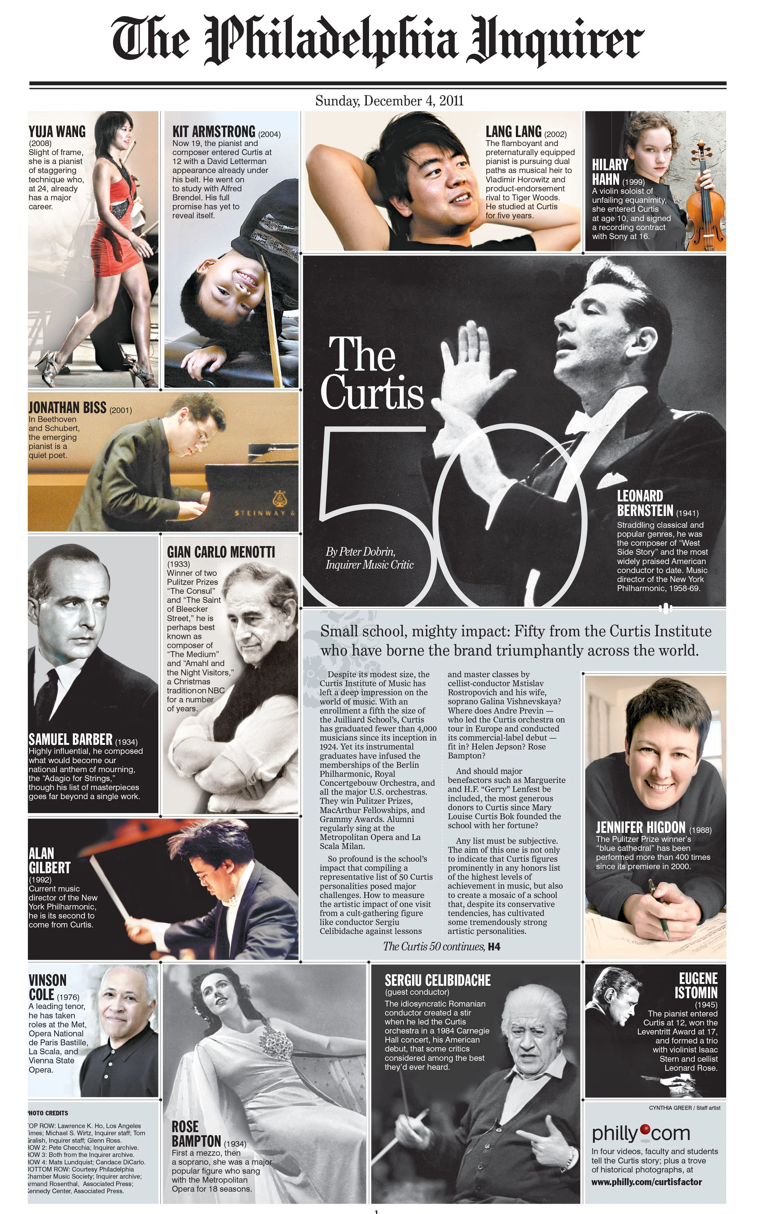
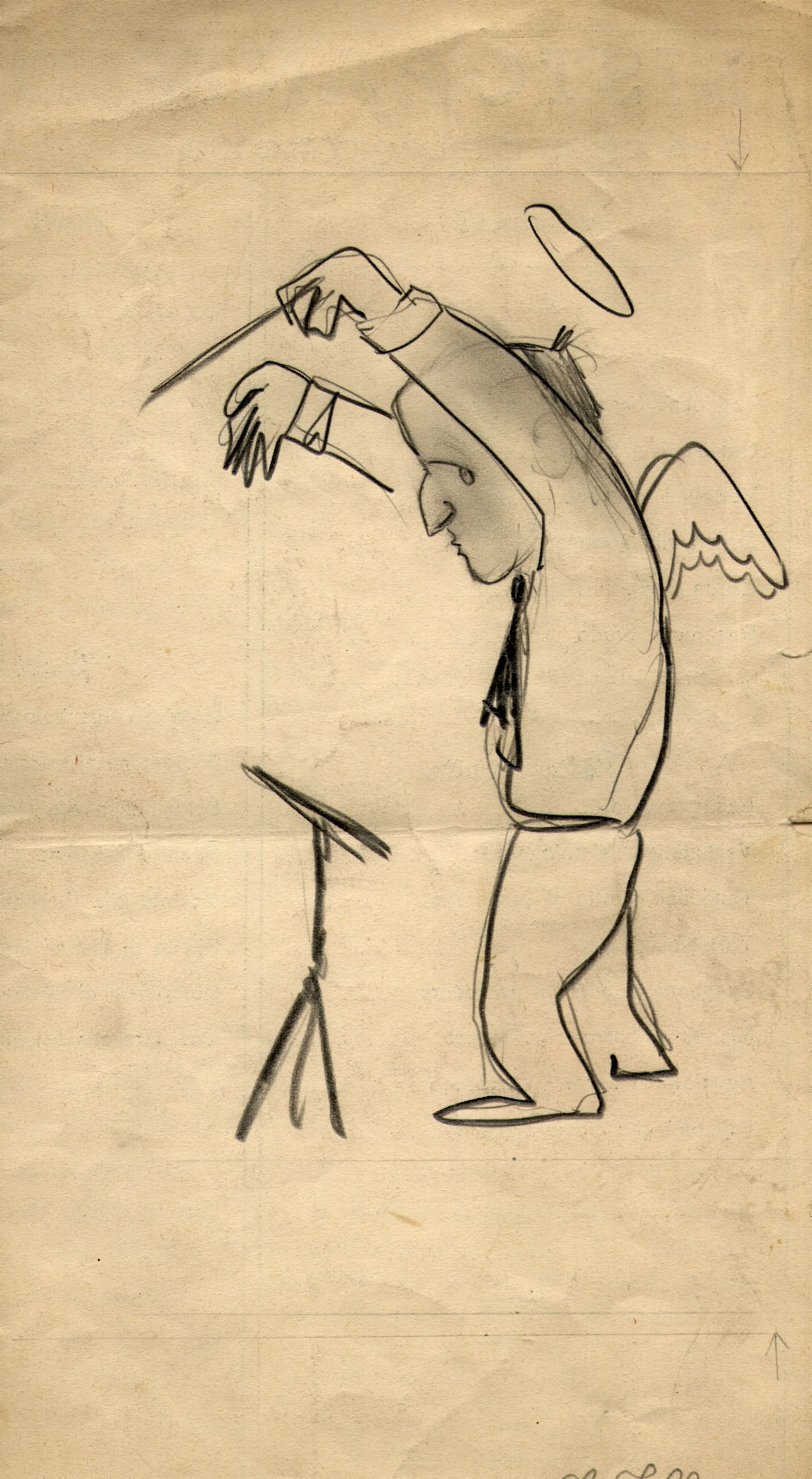
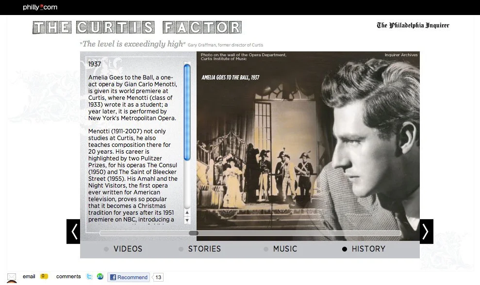
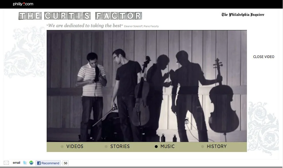
Above is sixteen minutes of the night we recorded a composition we commissioned for use in videos. We had grand dreams of a world premiere, a concert with sponsors, but in the end it was broadcast on PBS, loved by a live audience. The culture writer approached me about collaborating on something he had been wanting to do because we were successful and enjoyed working on another project together. The Curtis Institute of Music is a secret gem nestled in the heart of Philadelphia with cultural reach beyond it’s limestone and marble beginnings. Founded by Mary Louise Curtis Bok, a family member that owned “The Saturday Evening Post” among other popular nineteenth and twentieth century publications. Students included Leonard Bernstein, Lang Lang, Nino Rota, Gian Carlo Menotti, and Jennifer Higdon, and so many more influential women and men in music. The cellist in our video is now playing with the New York Philharmonic Orchestra, and the clarinetist is principal at the Fort Worth Symphony. The online formats, as I look at them today, are very dated, but the heart and soul sings volumes. I focused more on content this time. Tom Gralish shot current-day images. The print pages had online extensions, researching for 50 images of the expertly curated artists by Peter Dobrin was extensive. Nino Rota wrote music for “The Godfather.” I found only two images of him and a drawing of Rota by Federico Fellini on a napkin from a private collection in Italy.
KALI’S STORY: THE PLEASE TOUCH MUSEUM
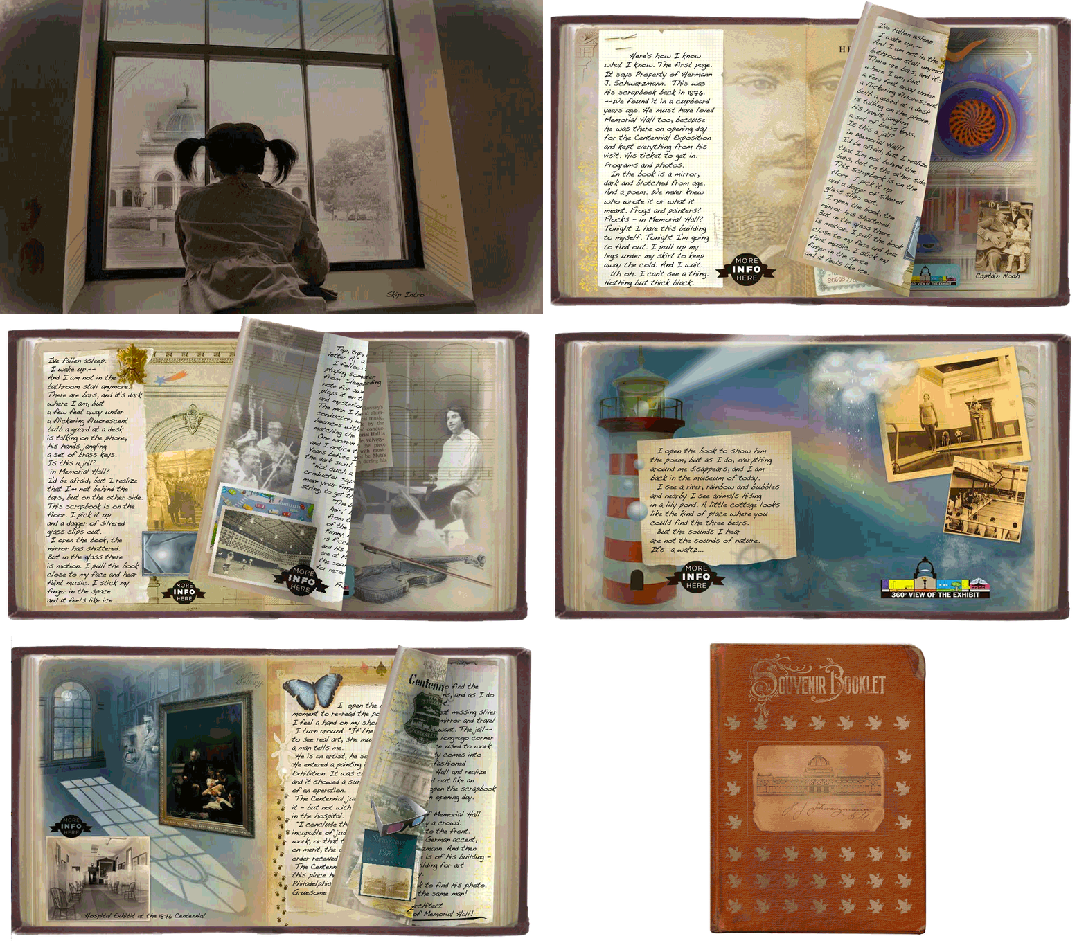
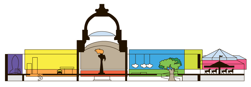
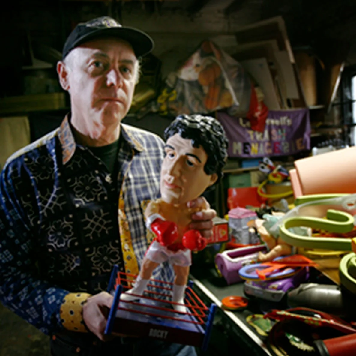
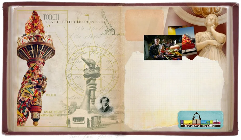
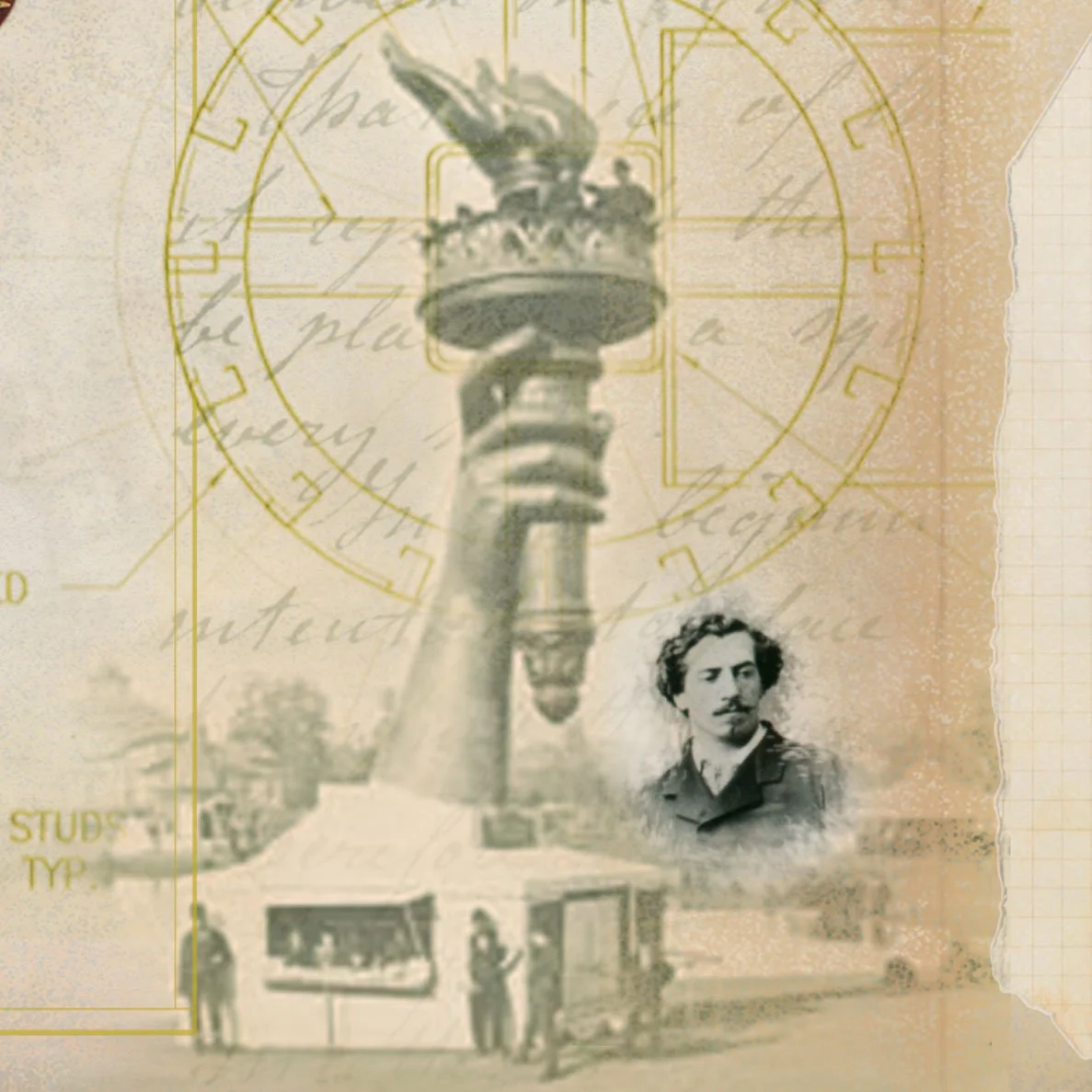
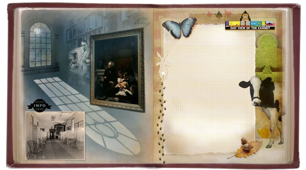
I spearheaded weekly 20-minute project meetings. Updates, brainstorms, print-product inclusion, critiques, assigning mid-project deadlines were on the agendas to avoid last minute flurries and to build the microsite along side construction milestones. It also gave room for creativity to bloom without the production process becoming overwhelming. It was in that space the lead culture writer Peter Dobrin, wrote an imaginary story about a young girl and her magic mirror to be the cohesive element for all we had to offer. I handled the visual reporting and backdrops for online. There were info timelines, new and historical photo essays, time lapse, hidden surprises, 360’s and videos, and the pages of collages I researched and edited. My icons and diagrams were entry points to VRs, photo galleries, and spotlights of information. The museum hosted the microsite for months after the opening and was recognized for journalistic innovation with several awards, including National Headliner. And everyone who contributed to the book had a great and memorable time.
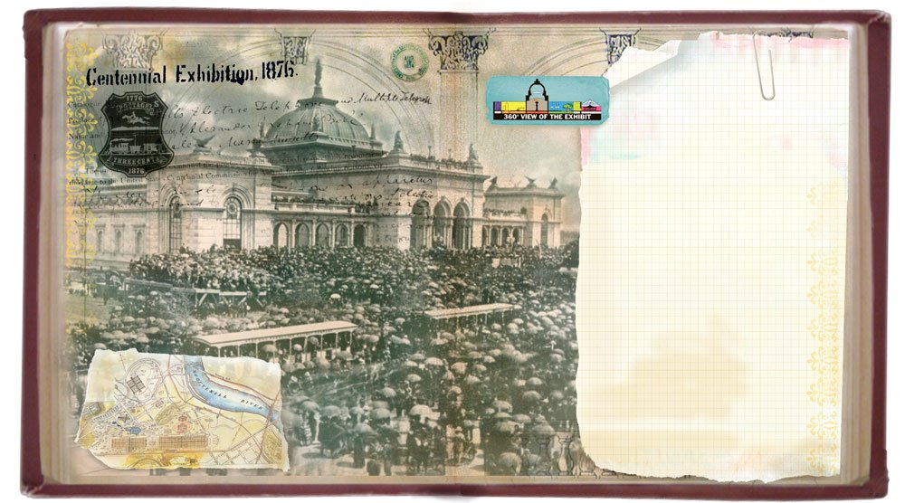
JUSTICE: DELAYED DISMISSED DENIED
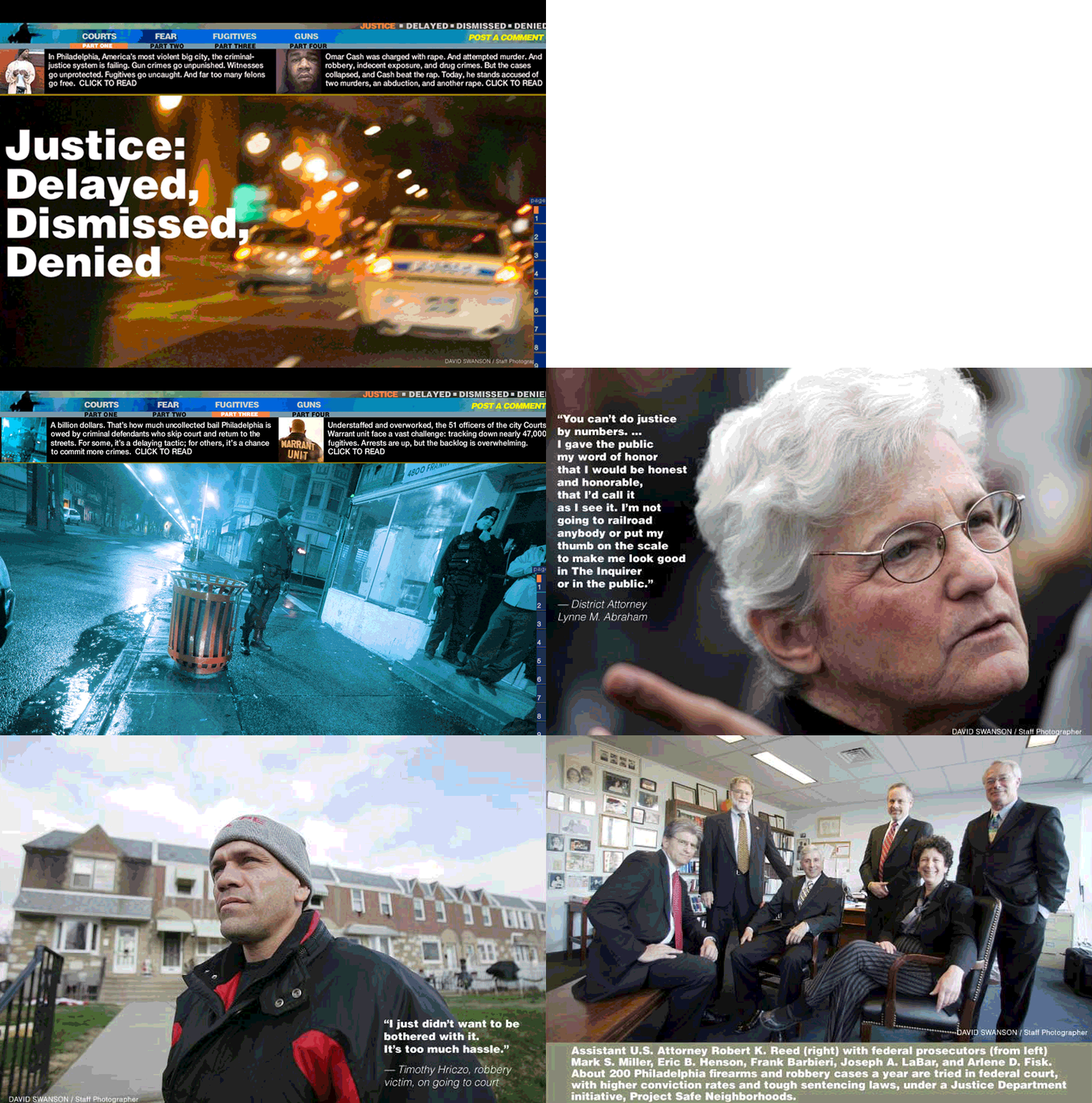
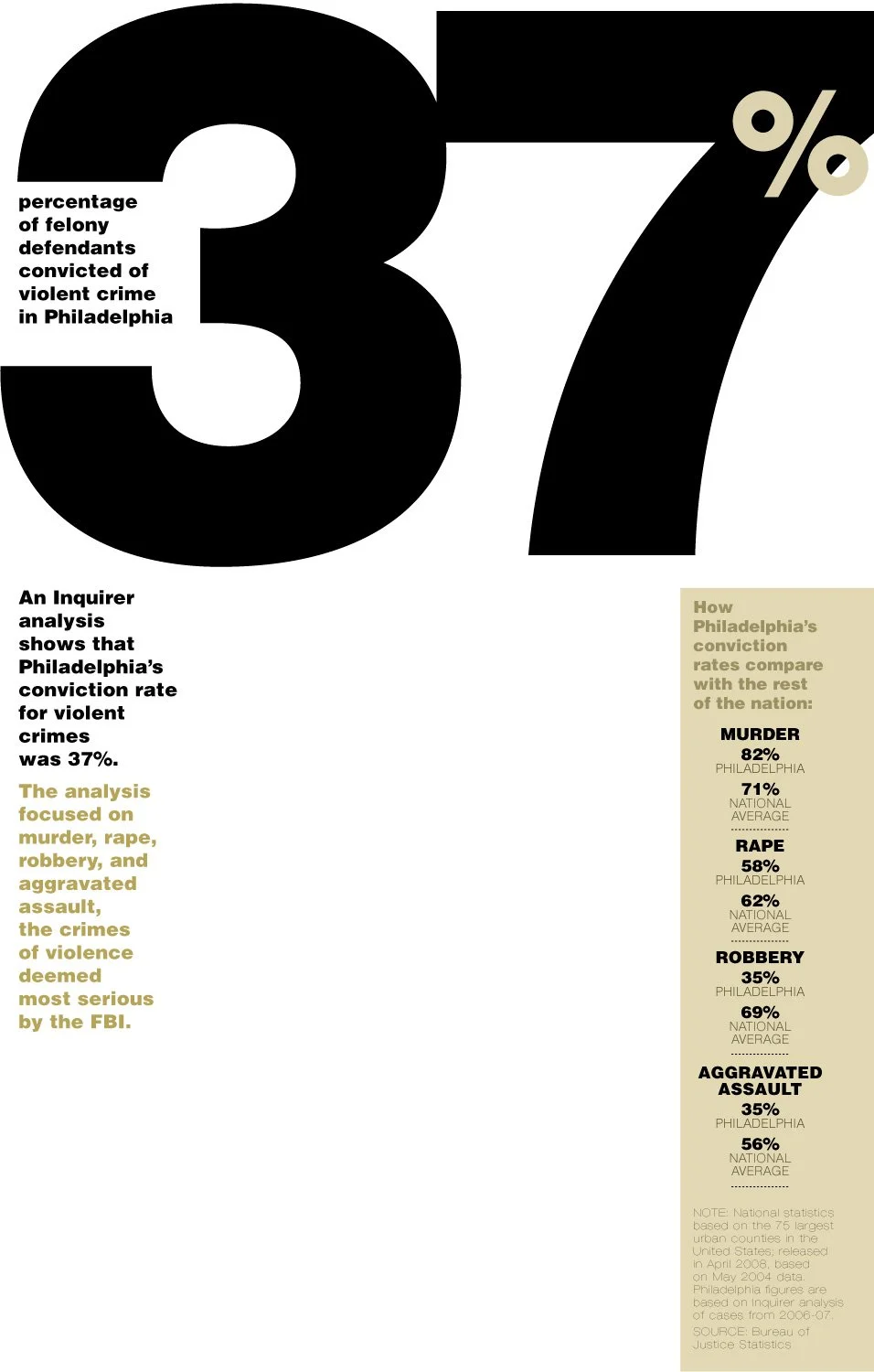
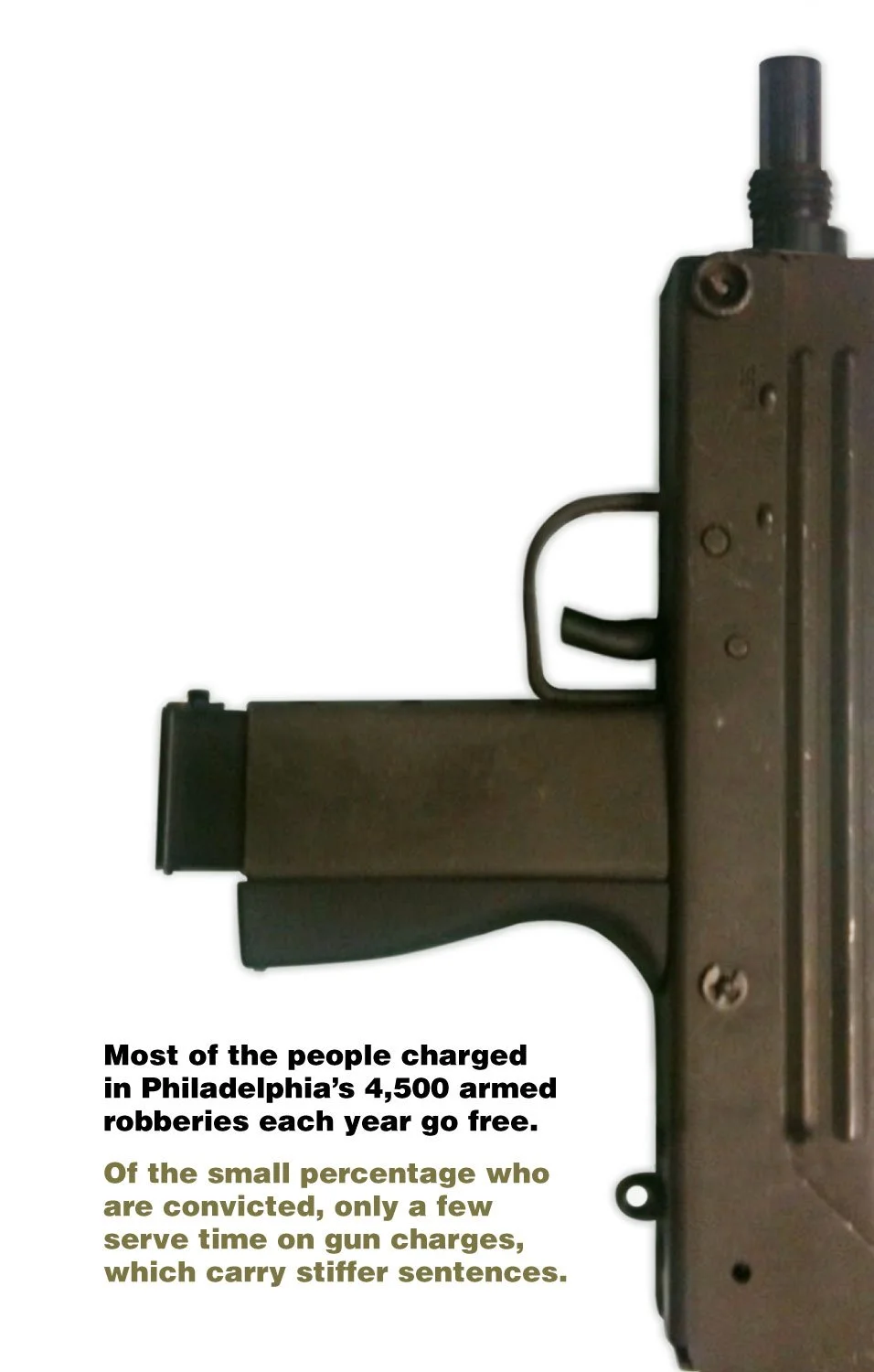
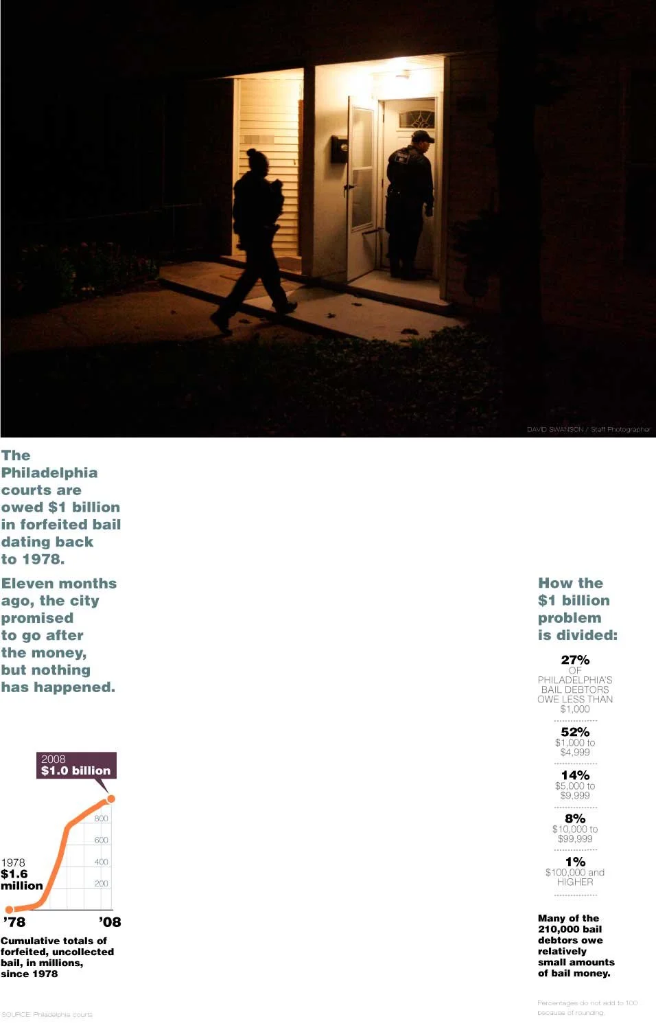
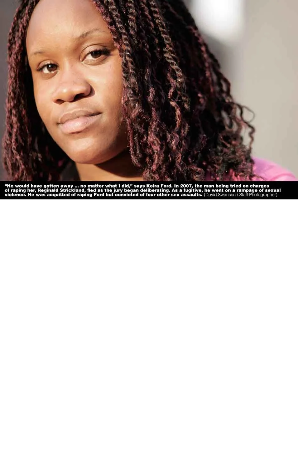
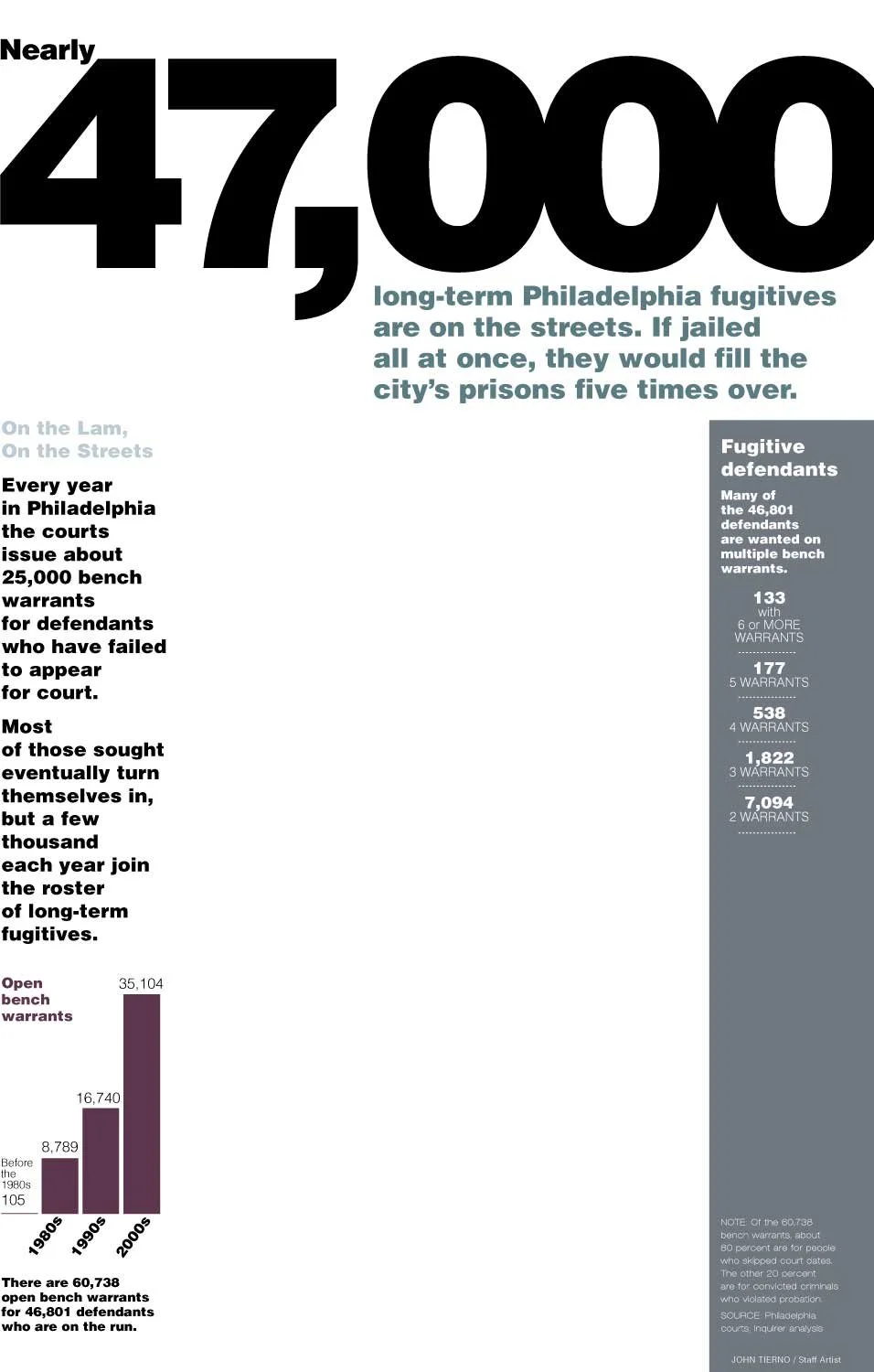
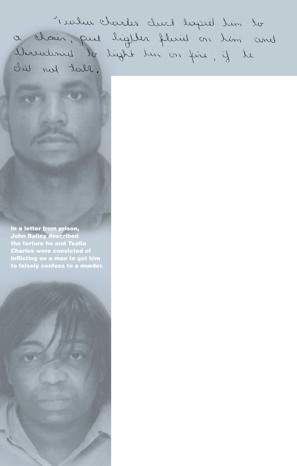
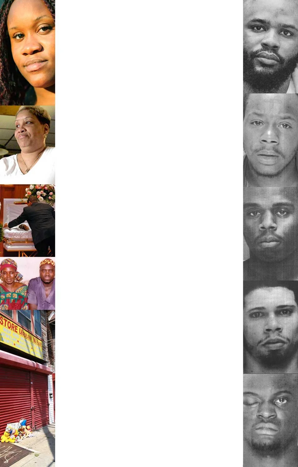
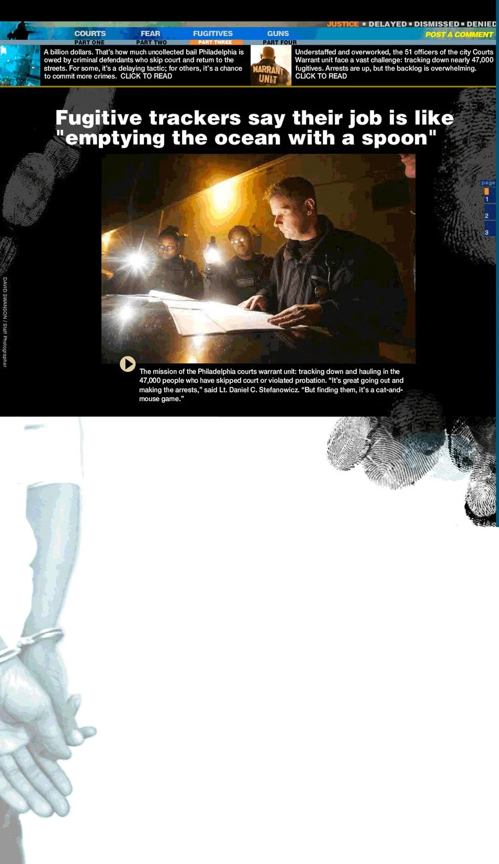
This long-term project was going to be written and edited and lengths changed for each day’s narrative up until the final minutes of deadline. So I designed a shell to run stories in, a template so to speak. The margins were filled with photos and data about Philadelphia’s woefull court system, they got some great numbers, and curated events from our files so there was lots of art. Our gritty photographers comfortable with the night-crime scene traveled with the main characters on the job and in their workplaces, so we had wonderful live art. The presentation was an ONA finalist for Innovative Journalism, large site.
MOVE +25 THE DEVASTATION OF OSAGE AVE.
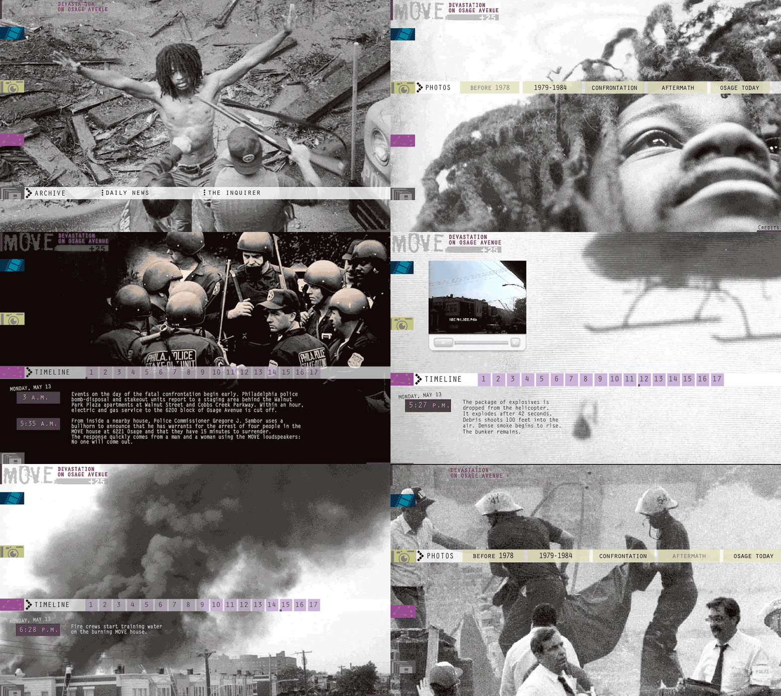
City government and services are measured by the years before the MOVE bombing May 13, 1985 and after. But you know in recent years the anniversary of the event is not talked about much, I suppose it is because the lives of so many people involved, wish it never happened. We took 25 years of recollection and the MOVE Commission’s official report to explain to citizens what had happened. Again the format is dated, not my decision. My job was content editing, explanation and design. I used a treasure trove of photography from the most-talented staff of two newspapers, inviting people to sit with the story of a tragedy again, from the very beginning, for a moment. This story never ends.
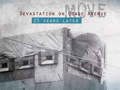
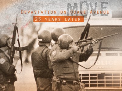
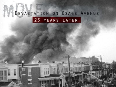
During the early philly.com years, producers welcomed the art I prepped, touts and promos for the series I designed, to place throughout the site.
CHANGING THE WORLD
The by product of good design can be unintended consequences. This group is a melange of assignments with influence. The wonders of this business are the moments when artwork inspires. I am a resource. I can illustrate feelings and information in a way that many can understand. And if that inspires change, a new way of seeing our world, or driving engagement for my newsroom, what a bonus. Artists and designers make a difference.

The special project editor complained to me that none of the video shot for a series had the same look. I had an idea and volunteered to create an intro for multiple videos styles, by multiple photographers, to solve the issue. A short burst of vibrant color and motion to start each narrative. The series went on to receive a Pulitzer and was commended by judges for the online presentation.

During the pandemic a service journalism editor was very supportive of my illustrations, using them instead of stock photos. Before AI was ready those stories would blanket search results, a small lifeline to our business. Also, a library of illos gave reporters, newsletter writers and editors immediate options to top their writing without a photo assignments or with a complicated subject. The set used by a columnist, above, mental and physical health issues post pandemic .
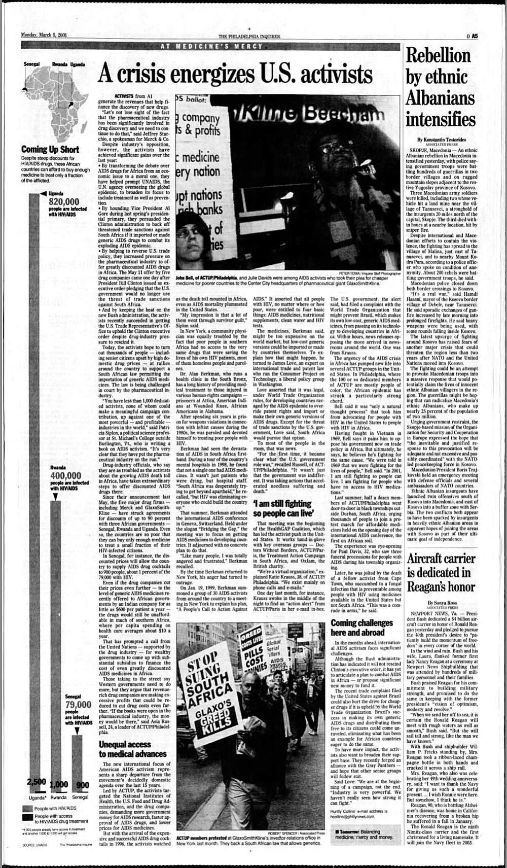
An effective visual resulted in more people receiving the medical treatment for AIDS that they needed across the African continent. This chart was published before Bono and RED, and the year after The Gates Foundation was formed.
I had lobbied the project editor, Charles Knittle, to run a simple chart the full depth of a page during a series by reporter Huntly Collins. How else could anyone see the disparity in the numbers? She sent us all an email ...
"Y'all will appreciate this...
It seems that our Monday graphic showing the piddling number of additional people to get AIDS meds in Senegal, Rwanda and Uganda under the drug company program was the final straw that pushed Merck to announce discounts of more than 50 percent today. At least that's the word from a Merck spokesman.
So, bravo, Cynthia! And Charles, you were right. It was very effective, perhaps more so than all the words we wrote. Huntly"

Looking for interesting digital projects in between page design, I wanted to celebrate the soltices and equinoxes with videos and graphics. Was not well received by my editors but the reporter went on to curate weather and science events for every season. Apple News picks up the story that boosts views by the millions each quarter. This is a test autumnal lead image, the sun kissing was a part for spring.
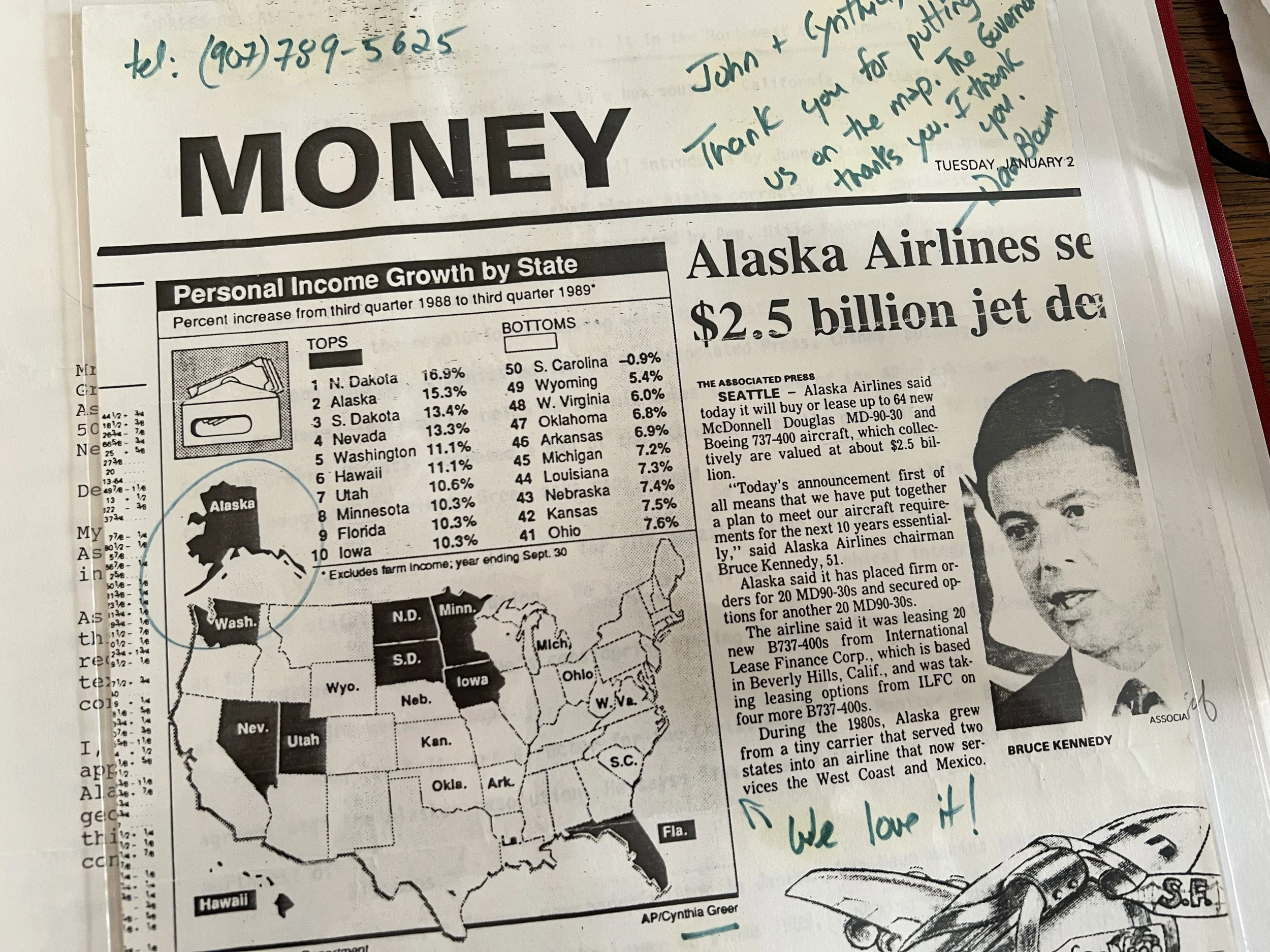
I have always felt comfortable using and publishing maps. I worked well with the Alaska bureau at AP and did many newsgraphics with his reporting. I render Alaska in the upper left, I regret that I can not make the state to scale, beating Texas, when I did 2-column graphics. The Governor and Lieutenant Governor noticed. I was read into Alaska’s legislative history to show their appreciation. I also have letters from each of them. Something so simple.
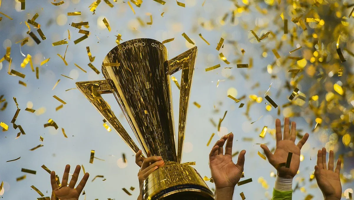
When I worked in sports management, CONCACAF rebooted the tournament between the soccer confederation’s teams in North America, Central America, and the Caribbean. The competition today is valued as a warmup to the World Cup, and a venue for the winner that qualifies them to play in other competitions around the world. I feel proud every time I see the trophy shape I designed being held up high, on streaming services or on a banner, or social.

Coloring book pages gained popularity with subscribers and company marketing colleagues every preseason and playoff moment. Numbers showed my last Super Bowl set was second behind the sport department’s numbers for new subscribers. I added information or vocabulary to subsequent sets of the originals working with Sports producer and reporter. We enjoyed interacting when parents shared photos of their proud children and their colored pages.